
House of Willow Alexander · An origin story
The Artwork of the House.
A design-led story of heritage, craft, colour, and British domestic beauty. How the House of Willow Alexander was cultivated, not branded.
↓ ten chapters
Every house begins with a name
Chapter I
A name chosen like a dedication.
Willow, inspired by Samuel's mother's favourite tree. A symbol of resilience, softness, and quiet magic. A tree that bends but never breaks. Alexander, the name of the co-founder. Steady, classical, architectural. The grounding note that anchors the lyricism of the willow.
Together, they form a name with its own mythology, a name that sounds as though it has lived on bookshelves and brass plaques for generations.
The birthplace
Chapter II
A garden studio, and a little magic.
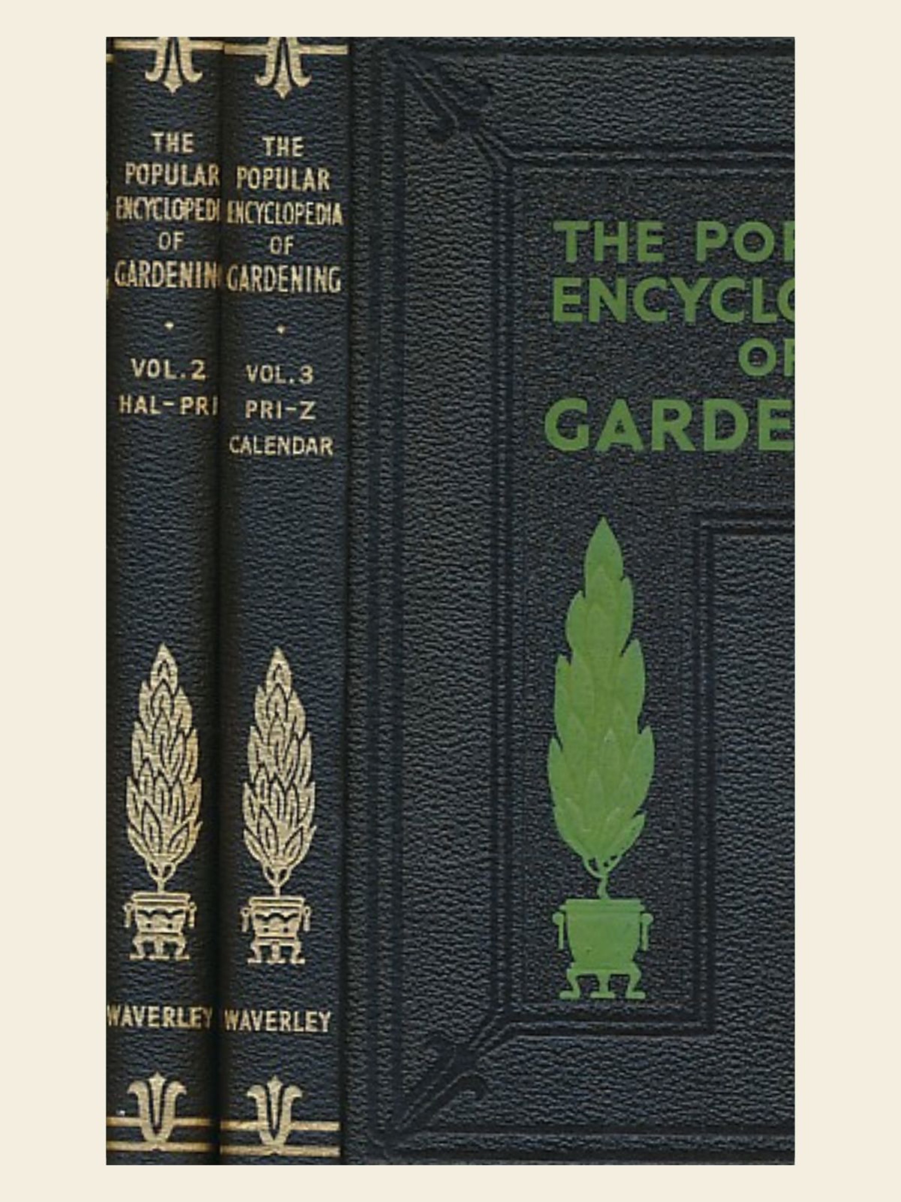
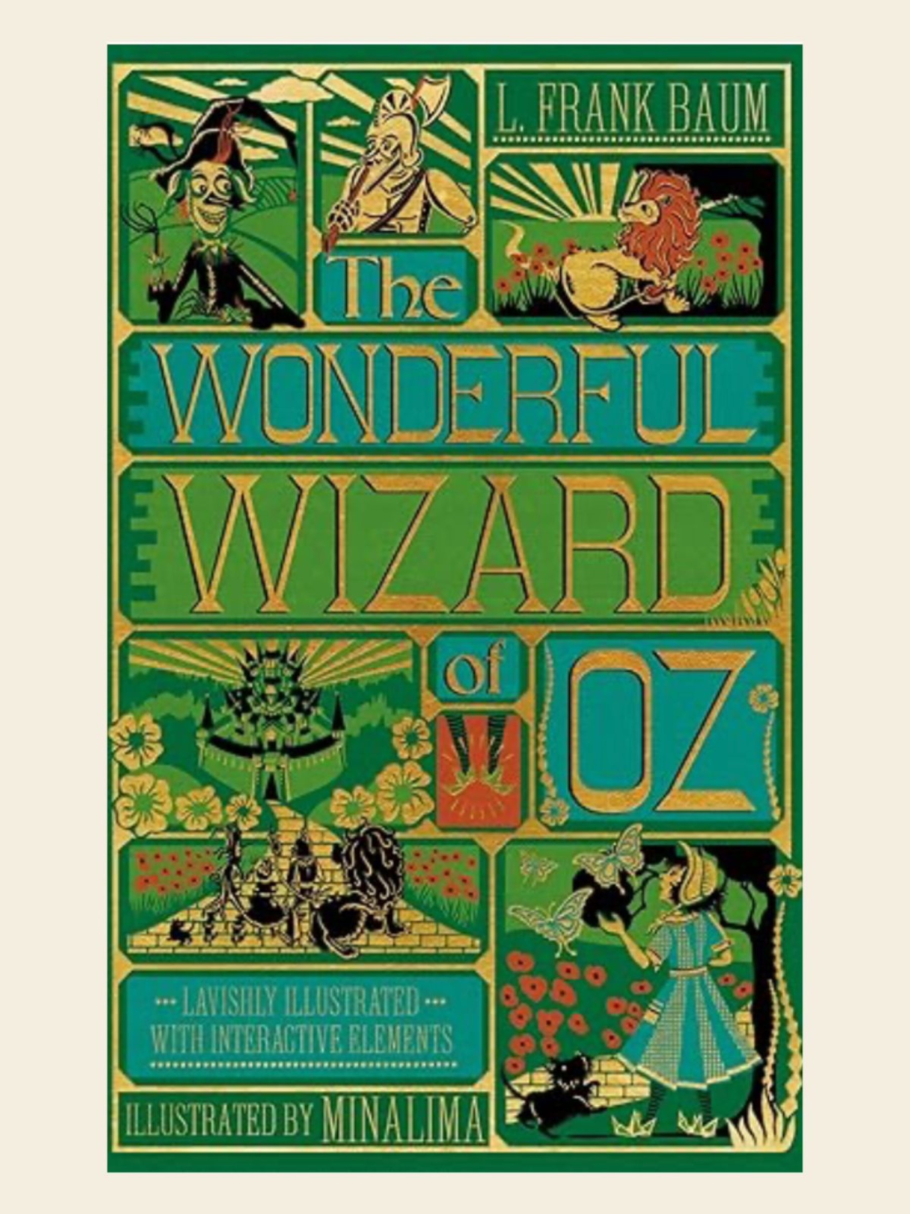
The brand began as a garden design studio, its creative cradle. Two artefacts lit the spark: a vintage copy of The Wizard of Oz, with typography that danced between fantasy and serif authority, and an antique gardening encyclopaedia, bound in deep green and black.
From these came our first palette: heritage green, grounded in nature, paired with a thread of gold, a subtle spark of magic. Earthy, enchanting, quietly theatrical.
The Victorian discovery
Chapter III
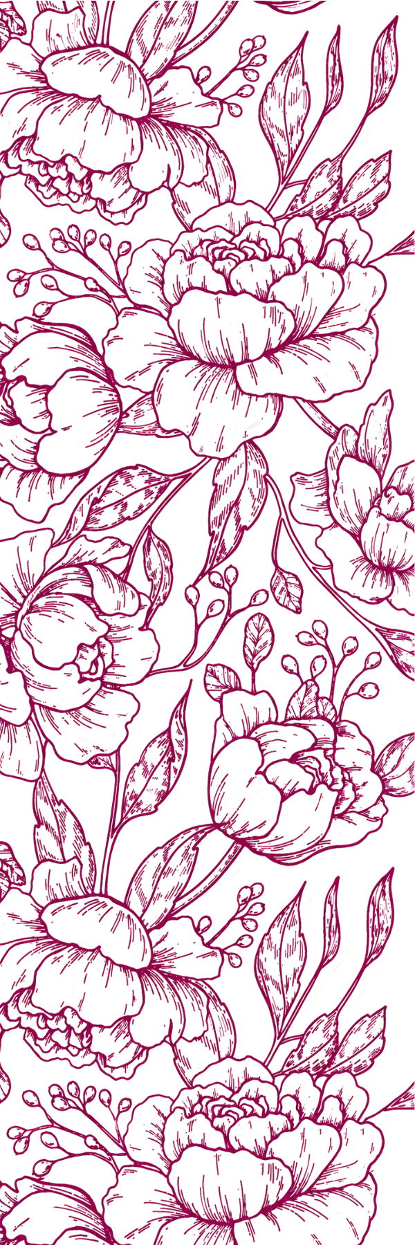
Mrs Beeton, and the first pattern.
Studying British design history, Samuel encountered the ornate world of Mrs Beeton, the Victorian matriarch of British domestic culture. Her books were more than manuals; they were artworks. Engraved botanical frames, decorative florals, meticulous linework.
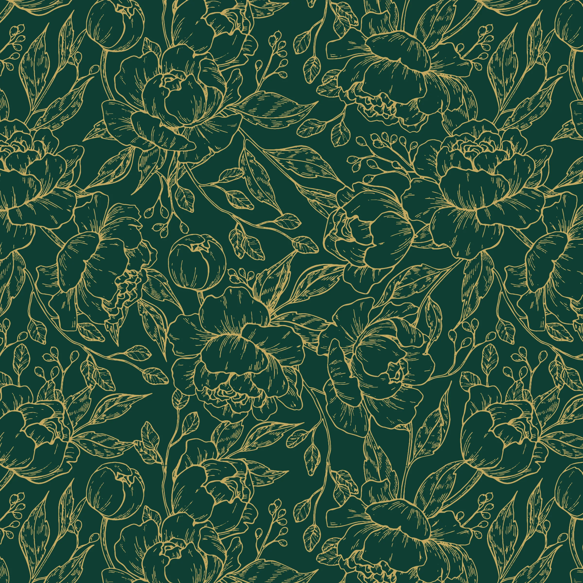
From these illustrations came the first Willow Alexander pattern: a continuous hand-drawn floral tapestry, originally rendered in gold on deep green. The pattern connected horticultural expertise to domestic authority, garden and home united under a single illustrated canopy.
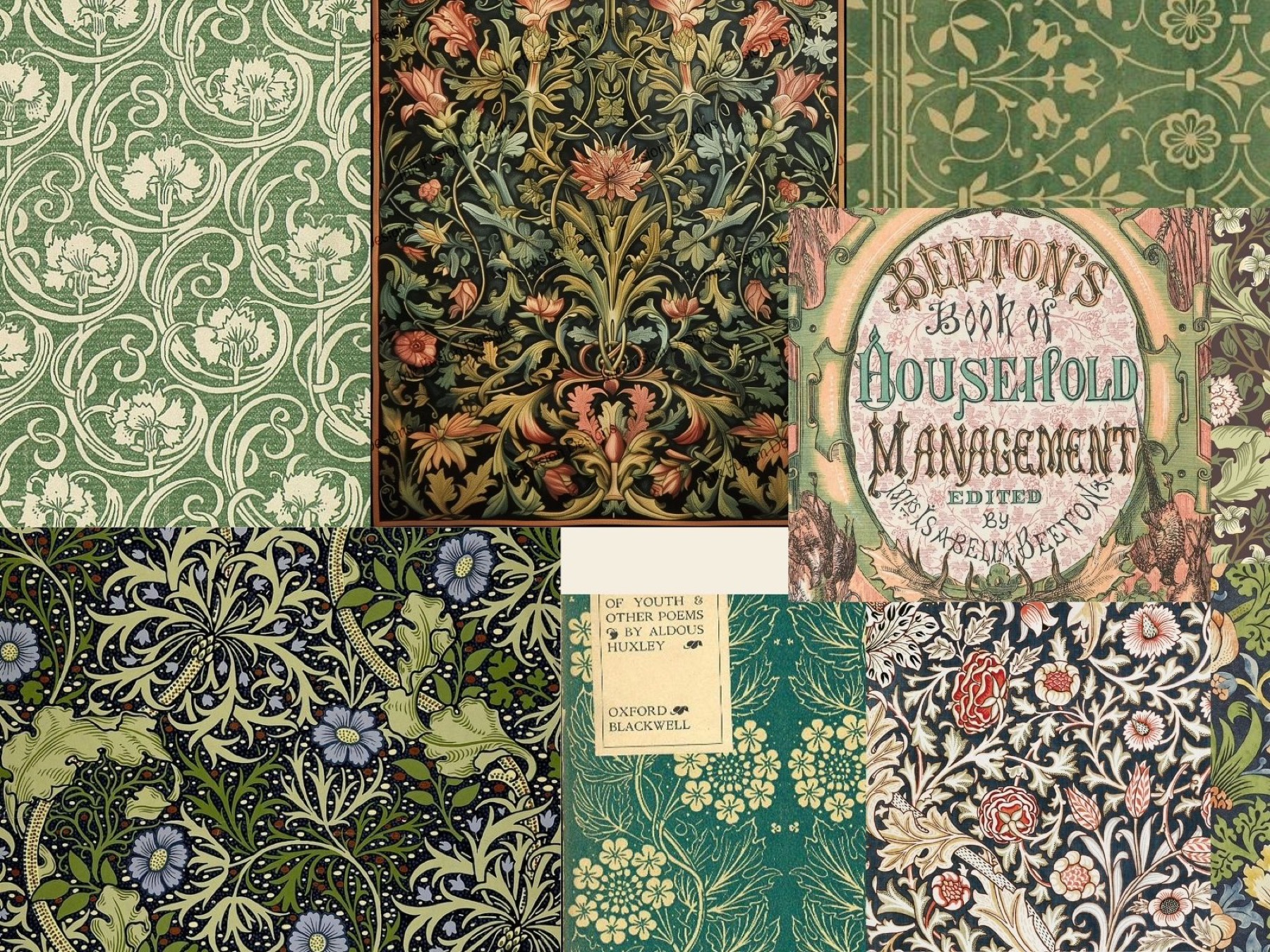
“Not in trend, but in tradition. Not in decoration, but in cultural lineage.”
The coloured volumes
Chapter IV
A library that became a fleet.
Mrs Beeton's books came in coloured editions. Greens. Blues. Burgundies. Teals. Auburns. Magentas. A row of them looked like the rainbow of British housekeeping, each spine a different discipline of domestic life.
Years later, those colours resurfaced as the perfect design system. Each Willow Alexander service became its own volume in the library of the House, wrapped in the same white floral pattern, transformed into a moving anthology of expertise.


The seven coloured volumes, the moving anthology of expertise.
“This is not a rainbow. It is a system, a coded, crafted chromatic identity rooted in British publishing history.”
From studio to institution
Chapter V
When a studio became a House.
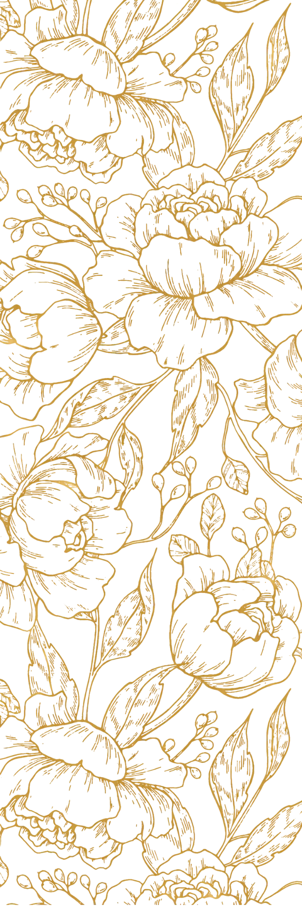
As the brand expanded, the name began to behave like something larger than a business. It became a House. The service brands became its children. The House became the library, the host, the institution.
Visually, this required an evolution. Gold stepped forward as the primary colour of the House. Cream became the fresh, editorial canvas. The floral pattern transformed from decorative heritage into institutional insignia, used with elegance and restraint.
Heritage modernism replaced whimsy. Editorial clarity replaced embellishment. Quiet confidence replaced decorative charm.
The pattern today
Chapter VI
Linework, as a language.
The floral pattern now functions as one of the House's most important design devices. It speaks differently depending on where it lives.
For the institution: gold or white linework, used sparingly, as a frame, a border, a whisper, the visual equivalent of a monogram. For the service brands: white pattern set boldly over their Beeton-inspired colourways, a visual genealogy linking each discipline back to the House. For editorial and the marketplace: the pattern deepens, softens, expands; becomes atmosphere, textile, mood.
The pattern does what the House does. It unites many worlds with quiet authority.
The early icons
Chapter VII
A human hand in the margins.
In the early years, a family of hand-drawn icons appeared across the brand, sketches inspired by the doodles and recipe notes a mother might scribble in the margins of her favourite cookbook. They expressed warmth, familiarity, the human hand behind the services.
As the House matured, the icons gently stepped back. They live now mostly in the archive, but their spirit remains in the tone of voice: warm, observant, never cold.
Garden shears
Watering can
Wheelbarrow
Toolkit
The fleet van
The pet at the door
The handshake at handover
Earth, in the round
The ecosystem
Chapter VIII
A living, design-led universe.
The House is now a complete aesthetic ecosystem: institution, service brands, editorial voice, modern intelligence. Every part is threaded together by name, colour, pattern, story. Nothing stands alone.
The Ecosystem
A living, design-led universe.
Threaded together by name, colour, pattern, story. Nothing stands alone. Everything belongs.
the institution
House of Willow Alexander
The institution. The editorial centre. The mother brand.
sibling
The Service Brands
The coloured volumes. Specialist, bold, unmistakable.
sibling
Home & Garden
The marketplace, the lifestyle universe, the curated home.
voice
The Hearth
Lifestyle magazine. Where the pattern becomes atmosphere.
intelligence
HoWA & Housekeeper
The modern intelligence of the House. Luminous, instrument-like.
horizon
Future categories
Homeware. Textiles. Academy. Retail pods. AI design tools.
Tap any sibling to enter that world.
The philosophy
Chapter IX
Beauty as responsibility.
At the heart of the House lies a belief: that homes and gardens are not simply spaces, but expressions of care. That craftsmanship and sustainability are not trends, but inherited duties. That beauty is not excess, but an act of stewardship.
The artwork of the House, its colours, its patterns, its names, its stories, is a reminder that design matters because life matters. That what we touch daily should be crafted with intention.
A living story
Chapter X
Rooted in the past. Growing into the future.
The artwork of the House is not finished. It evolves with every new service, every new product, every new idea. But its foundation is set: a name planted like a tree, a palette lifted from literature, a pattern drawn from Victorian craft, a fleet inspired by British domestic history. A brand that feels discovered, not invented.

The House of Willow Alexander
A modern British institution built on design, story, care
and the extraordinary beauty of home.
Ownership is passive. Stewardship is intentional.