Color Trends for 2025: The New British Palette
As we move into 2025, British interior color trends reflect a sophisticated evolution that balances innovation with timelessness, global influences with local sensibilities, and aesthetic appeal with psychological well-being. This…
House of Willow Alexander·
As we move into 2025, British interior color trends reflect a sophisticated evolution that balances innovation with timelessness, global influences with local sensibilities, and aesthetic appeal with psychological well-being. This year’s palette represents more than mere fashion—it embodies our collective response to social shifts, environmental concerns, and changing lifestyles. Understanding these emerging color directions offers both practical guidance for immediate design decisions and deeper insight into how our relationship with color continues to evolve in response to our changing world.
The Cultural Context of Color Trends
Before exploring specific color directions, it’s worth understanding the broader cultural factors shaping our color preferences in 2025.
Post-Pandemic Color Psychology
“The pandemic fundamentally altered our relationship with our homes and, consequently, the colors we choose for them,” explains color psychologist Dr. Emma Richardson. “We’ve seen a gradual shift from the reactive color choices of the immediate post-pandemic period—which often prioritized comfort and security—toward more nuanced palettes that balance emotional well-being with renewed optimism.”
This evolution reflects our collective processing of a significant global event, with color choices increasingly focused on creating environments that support both psychological restoration and forward-looking energy.
Sustainability’s Influence on Color Perception
Environmental consciousness continues to profoundly influence color trends, affecting both the pigments themselves and the associations they evoke.
“Today’s most influential color trends reflect growing environmental awareness in two distinct ways,” notes sustainability consultant Marcus Chen. “First, in the increasing preference for pigments with lower environmental impact, including natural dyes and low-VOC formulations. Second, in the growing appreciation for colors that evoke connection to nature and sustainable materials.”
This dual influence creates color trends that are both aesthetically appealing and aligned with evolving environmental values.
Technology and Color Experience
Advancing technology continues to influence how we experience and interact with color in our homes.
“Smart lighting systems that can transition through different color temperatures throughout the day are transforming how we think about interior color schemes,” explains lighting designer Charlotte Davies. “Static color choices are increasingly giving way to dynamic palettes that can shift to support different activities and biological needs.”
This technological dimension adds complexity to color trends, requiring consideration not just of how colors appear under standard conditions but how they transform under different lighting scenarios.
The 2025 British Color Directions
Against this cultural backdrop, several distinct color directions have emerged in British interiors for 2025.
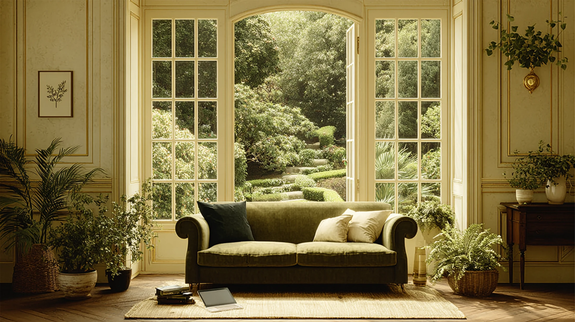
Vaporized Tones: The New Neutrals
Perhaps the most significant shift in the 2025 color landscape is the emergence of what color forecasters are calling “vaporized tones”—hues that appear to have had their saturation partially extracted, creating colors that function as sophisticated neutrals while maintaining distinct character.
“Vaporized tones occupy the space between clear colors and traditional neutrals,” explains color trend analyst Olivia Harrington. “These hues—imagine sage with its intensity dialed back, or terracotta that’s been softened to a whisper—create versatile backgrounds that carry subtle emotional qualities without overwhelming spaces.”
This trend represents a significant evolution from the stark whites and cool greys that dominated minimalist interiors in previous years, offering greater emotional warmth while maintaining visual restraint.
Key Vaporized Tones for 2025:
– Calcite: A softened, slightly greyed blue with remarkable versatility
– Vetiver: A desaturated olive that bridges between neutral and color
– Dust: A barely-there terracotta that functions as a warm neutral
– Chalk: A softened off-white with subtle green undertones
– Mist: A vaporized lavender that creates soothing, barely-there color presence
These sophisticated hues create serene backgrounds that support well-being while providing more character than traditional neutrals.
Grounded Pigments: Earth Connection
Complementing the vaporized tones, more saturated earth-derived hues have emerged as important accent colors in the 2025 palette.
“These colors establish direct connections to natural pigments historically derived from earth, minerals, and plants,” notes historical color specialist Dr. James Foster. “Their visual weight and natural associations create grounding elements in interiors dominated by lighter vaporized tones.”
This direction reflects growing interest in historical color production methods and natural pigments, with colors that feel authentic and connected to traditional craftsmanship.
Key Grounded Pigments for 2025:
– Ochre: A rich, earthy yellow with historical significance in British decorative traditions
– Oxide: A rusty red-brown reminiscent of natural iron pigments
– Umber: A deep, complex brown with subtle green undertones
– Malachite: A verdant green with mineral associations
– Clay: A rich terracotta with depth and warmth
These colors work particularly well in period properties and spaces seeking connection to British decorative heritage.
Emotional Chromas: Mood-Enhancing Accents
Beyond neutrals and earth tones, 2025 sees the emergence of more vibrant hues specifically selected for their psychological impact.
“These colors are being deployed strategically in interiors to create specific emotional responses,” explains color psychologist Thomas Blake. “Rather than using these more saturated hues throughout spaces, designers are creating intentional ‘color moments’ that trigger positive psychological effects.”
This targeted approach allows for emotional color impact without overwhelming spaces, creating focal points that draw the eye and lift the mood.
Key Emotional Chromas for 2025:
– Optimist: A clear, slightly muted yellow that stimulates positive thinking
– Tranquil: A complex blue-green that reduces stress responses
– Energize: A balanced red with orange undertones that stimulates conversation
– Focus: A deep teal that enhances concentration
– Joy: A coral-pink that consistently registers as mood-enhancing in research studies
These colors are typically used in smaller applications—perhaps a piece of furniture, a feature wall in a smaller room, or textile accents—where their psychological impact can be experienced without domination.
Heritage Revisited: Contemporary Takes on Traditional British Colors
The continuing renovation of period properties has sparked renewed interest in historical British color palettes, reinterpreted for contemporary sensibilities.
“We’re seeing sophisticated reinterpretations of colors from significant periods in British decorative history,” notes architectural historian Dr. Sophia Williams. “These aren’t slavish reproductions of historical colors but rather contemporary evolutions that reference heritage while feeling relevant to today’s interiors.”
This direction connects to the broader trend of honoring architectural integrity while creating livable, contemporary interiors.
Key Heritage Revisited Colors for 2025:
– Modern Georgian: A complex gray-green adapted from Georgian color schemes
– Neo-Victorian: A deepened mauve that references Victorian palettes without their heaviness
– Bloomsbury: A dusty blue inspired by the Bloomsbury Group’s color sensibilities
– Manor: A rich brown with purple undertones drawn from British country house libraries
– Cottage: A softened sage that references traditional British rural interiors
These colors work particularly well in period properties where they create dialogue between architectural heritage and contemporary living.
Biophilic Hues: Nature’s Continuing Influence
The biophilic design movement—which seeks to strengthen human connection to nature through the built environment—continues to influence color trends in 2025.
“Biophilic color palettes go beyond simply using green,” explains biophilic design consultant Emma Blake. “They incorporate the full spectrum of colors found in natural environments, from the blues of sky and water to the complex browns of soil and wood, creating spaces that subconsciously register as natural and restorative.”
This direction reflects research demonstrating the positive psychological and physiological effects of nature-connected environments.
Key Biophilic Hues for 2025:
– Canopy: A complex green with blue undertones reminiscent of woodland light
– Lichen: A gray-green with subtle yellow undertones inspired by this resilient organism
– Mushroom: A complex taupe with subtle pink undertones drawn from forest floors
– Sky: A gentle blue with remarkable depth that changes with light conditions
– Bark: A rich brown with subtle red undertones that brings warmth to interiors
These colors create subtle connections to natural environments, supporting well-being through biophilic associations.
Room-Specific Color Trends for 2025
Beyond general color directions, distinct trends have emerged for specific rooms, reflecting their particular functions and emotional requirements.
Living Room Color Trends: Sophisticated Comfort
Living rooms in 2025 embrace colors that balance sophistication with genuine comfort, creating spaces that feel simultaneously elevated and relaxed.
“The most successful living room color schemes for 2025 create what we’re calling ‘elevated ease’—spaces that feel curated and considered but never stiff or unwelcoming,” suggests interior designer Charlotte Moore. “This typically involves layering different color values within a cohesive palette rather than high-contrast combinations.”
This approach creates living rooms with visual depth that remain restful rather than stimulating—spaces that facilitate both relaxation and connection.
Key Living Room Colors for 2025:
– Foundation colors: Vaporized tones like Calcite and Vetiver create sophisticated backgrounds
– Accent directions: Deeper nature-inspired hues like Canopy and Bark add visual weight
– Highlight notes: Selective use of Emotional Chromas like Optimist or Joy in small applications
This layered approach creates living rooms with sufficient visual interest to feel designed while maintaining the restfulness needed for daily relaxation.
Bedroom Color Trends: Sleep Science Influence
Bedroom color trends for 2025 show increasing influence from sleep science research, with palettes specifically designed to support quality rest.
“The latest research on sleep environments is directly influencing bedroom color choices,” explains sleep environment specialist Dr. Nathan Harris. “Colors that reduce cognitive stimulation and create associations with natural sleep environments are proving most effective for sleep quality.”
This science-informed approach prioritizes functional effectiveness alongside aesthetic appeal, creating bedrooms that actively support well-being.
Key Bedroom Colors for 2025:
– Wall colors: Muted blues like Calcite and deep greens like Canopy consistently support quality sleep
– Ceiling treatments: Deeper colors than walls create cocoon-like environments that improve sleep metrics
– Accent notes: Lavender tones like Mist incorporate traditional sleep-supporting color associations
These research-backed color applications create bedrooms that function as genuine sleep sanctuaries rather than merely attractive spaces.
Kitchen Color Trends: Warmth Returns
After years of white and gray dominance, kitchen color trends for 2025 show a decisive return to warmth and character.
“The clinical, laboratory-like kitchens of recent years are giving way to spaces with greater warmth and personality,” notes kitchen design specialist Marcus Blackwood. “This doesn’t mean a return to heavy, traditional wood tones, but rather a new interpretation of warmth through complex neutrals and strategic color applications.”
This evolution reflects the kitchen’s continuing role as a social hub rather than merely a functional space.
Key Kitchen Colors for 2025:
– Cabinetry trends: Vaporized tones like Dust and Vetiver create warmth without heaviness
– Island statements: Deeper accent colors like Oxide or Malachite create focal points on island units
– Backsplash opportunities: Emotional Chromas like Energize add strategic color moments without overwhelming
This approach creates kitchens that balance practical requirements with the emotional warmth needed for spaces where people naturally gather.
Bathroom Color Trends: Spa-Inspired Serenity
Bathroom color trends for 2025 continue to draw inspiration from luxury spa environments, with palettes designed to create restorative experiences.
“The bathroom has fully transitioned from purely functional space to personal wellness retreat,” explains bathroom designer Olivia Wright. “Color schemes now prioritize creating emotional states conducive to relaxation and rejuvenation rather than merely looking attractive.”
This wellness-focused approach creates bathrooms that actively contribute to daily self-care routines.
Key Bathroom Colors for 2025:
– Primary palettes: Water-inspired blues and greens like Sky and Lichen create subconscious associations with purification
– Grounding elements: Earth tones like Clay and Umber create balance and prevent clinical feelings
– Accent opportunities: Small applications of Joy or Tranquil enhance positive emotional associations
These thoughtfully selected colors transform utilitarian spaces into genuine wellness environments that support both physical and emotional well-being.
Home Office Color Trends: Cognitive Support
With remote work firmly established, home office color trends for 2025 focus on cognitive support and productivity enhancement.
“Home office color schemes are increasingly informed by research on how color affects cognitive function,” explains workplace psychologist Dr. James Harrington. “Different color applications can support different types of thinking—from focused concentration to creative ideation.”
This function-first approach creates work environments that actively support professional effectiveness rather than merely looking appropriately serious.
Key Home Office Colors for 2025:
– Focus-supporting backgrounds: Blues and blue-greens like Tranquil and Focus enhance concentration
– Creative thinking accents: Strategic use of Optimist yellow stimulates innovative thinking
– Zoom-friendly considerations: Colors that create flattering backgrounds for video calls without distraction
These research-informed color applications create home offices that enhance professional performance while integrating harmoniously with residential environments.
Application Trends: How Colors Are Being Used in 2025
Beyond specific color selections, several distinct trends have emerged in how colors are being applied in British interiors.
Color Zoning in Open Spaces
As open-plan living continues to evolve, color is increasingly used to create distinct zones without requiring physical barriers.
“Color zoning uses subtle shifts in hue to define different functional areas within larger spaces,” explains spatial designer Thomas Blake. “This might involve different wall colors, floor treatments, or ceiling applications that create psychological boundaries while maintaining visual flow.”
This approach creates more functional open-plan environments that support different activities without losing the benefits of openness.
Fifth Wall Focus: Ceiling as Color Opportunity
Ceilings have emerged as significant color opportunities in 2025, moving beyond white to become active design elements.
“The ‘fifth wall’ is finally receiving the attention it deserves as a design opportunity,” notes interior architect Emma Richardson. “Ceiling color applications—whether matching walls for a cocooning effect, contrasting for architectural emphasis, or featuring decorative treatments—can transform spatial perception more dramatically than wall color alone.”
This focus on overhead planes creates more complete, enveloping color experiences that affect how spaces feel rather than merely how they look.
Tonal Layering Rather Than High Contrast
Rather than high-contrast color combinations, 2025 sees increasing preference for tonal variations within related color families.
“Tonal layering—using different values and intensities within the same color family—creates sophisticated depth without the visual stimulation of contrasting colors,” explains color consultant Dr. Amelia Chen. “This approach creates spaces that feel cohesive and restful while avoiding monotony.”
This subtle approach creates interiors with visual interest that remains calming rather than energizing—an important consideration for homes that need to support relaxation and recovery.
Architectural Color Blocking
Strategic color application to highlight architectural features has emerged as a significant trend in 2025.
“Architectural color blocking uses contrasting colors to emphasize interesting structural elements or to create them where they don’t naturally exist,” suggests architectural color specialist Marcus Chen. “This might involve highlighting a structural column, painting window reveals in contrasting colors, or using color to define a niche or alcove.”
This approach creates architectural interest through color alone, adding character to simpler spaces while emphasizing the features of more detailed environments.
Transitional Color Strategies
As homes increasingly incorporate diverse color schemes in different rooms, thoughtful transitions between spaces have become increasingly important.
“Transitional color strategies create harmonious flows between rooms with different color schemes,” explains interior designer Charlotte Davies. “This might involve using a color from one room as an accent in adjacent spaces, gradually shifting intensity along corridors, or using consistent undertones across different hues.”
These transitional approaches create homes that feel cohesive despite incorporating diverse color schemes in different functional areas.
Practical Application: Bringing 2025 Color Trends Home
Translating color trends into personal spaces requires thoughtful consideration of individual preferences, existing elements, and architectural context.
Assessing Trend Relevance to Your Space
Not all color trends will be appropriate for every home or align with every individual’s preferences.
“The most successful color applications begin with honest assessment of which trends resonate with your personal taste and lifestyle,” suggests color consultant Olivia Harrington. “Color should ultimately reflect the people who live with it rather than simply following external trends.”
This selective approach ensures that color choices enhance daily experience rather than creating environments that feel inauthentic or uncomfortable.
Testing Before Committing
Perhaps the most crucial practical advice for implementing 2025 color trends is thorough testing before application.
“Never select colors based solely on trend forecasts, small paint chips, or digital representations,” cautions paint specialist Dr. James Montgomery. “Colors transform dramatically based on specific light conditions, room dimensions, and surrounding elements.”
Effective testing involves:
– Painting large sample boards (at least 2′ square) rather than small swatches
– Viewing samples at different times of day to assess how changing light affects the color
– Placing samples against existing elements like flooring, cabinetry, and furniture
– Living with samples for several days to observe how your response evolves with familiarity
This thorough testing process prevents costly mistakes while ensuring selected colors will create the desired effect in your specific environment.
Phased Implementation Strategies
For those hesitant to commit fully to new color directions, phased implementation offers a lower-risk approach to incorporating 2025 trends.
“Consider beginning with smaller, reversible color applications before committing to larger changes,” suggests interior stylist Emma Blake. “Textiles, artwork, and even furniture can introduce new color directions without the commitment of painted surfaces.”
This gradual approach allows for living with new color directions before making more permanent changes, ensuring comfort with evolving palettes.
Working with Existing Elements
Few have the luxury of starting with completely blank spaces, making strategies for working with existing elements essential.
“Successful color updates work with rather than against existing elements like flooring, cabinetry, or architectural features,” notes renovation specialist Thomas Wright. “Identify the undertones in fixed elements and select new colors that either harmonize with these undertones or intentionally contrast with them in flattering ways.”
This pragmatic approach creates cohesive environments even when working with inherited or immovable elements.
Professional Guidance for Complex Situations
For particularly challenging spaces or significant color transformations, professional guidance can provide valuable expertise.
“Color consultants bring both technical knowledge about how colors behave in different conditions and trained eyes that can identify undertones and relationships that others might miss,” explains design psychologist Dr. Sophia Williams. “This expertise is particularly valuable for complex spaces with challenging light conditions or multiple existing elements to coordinate.”
This professional perspective can prevent costly mistakes while identifying opportunities that might otherwise be overlooked.
Conclusion: Beyond Trends to Timeless Color Principles
While color trends provide valuable insight into evolving tastes and cultural shifts, the most successful color applications balance awareness of these trends with more timeless principles of color psychology, architectural appropriateness, and personal meaning.
The 2025 British color directions—from vaporized tones and grounded pigments to emotional chromas and biophilic hues—offer sophisticated options for creating homes that feel both current and enduring. By understanding both the specific colors emerging this year and the broader principles guiding their application, you can create spaces that reflect contemporary sensibilities while remaining authentic to your personal preferences and lifestyle needs.
As you consider updating your home’s color scheme, remember that the most successful colors are those that create environments where you personally thrive—spaces that support your well-being, align with your aesthetic preferences, and enhance your daily experience. By thoughtfully selecting from 2025’s color directions with these personal considerations in mind, you can create interiors that feel simultaneously fresh and timeless—spaces that will continue to resonate long after current trends have evolved into new directions.