Room-by-Room Colour Psychology: How Hues Affect Your Mood
The colour we choose for our homes do far more than simply please the eye—they actively influence our psychological and physiological responses, affecting everything from our mood and energy levels…
House of Willow Alexander·
The colour we choose for our homes do far more than simply please the eye—they actively influence our psychological and physiological responses, affecting everything from our mood and energy levels to our perception of time and space. This powerful relationship between Colour and human experience forms the foundation of Colour psychology, a discipline that has evolved from ancient cultural practices into a science-backed approach to interior design. Understanding how different hues affect us in various contexts allows for intentional Colour selection that supports the specific function and desired atmosphere of each room in your home.
The Science Behind Colour Psychology
Before exploring room-specific Colour applications, it’s worth understanding the scientific foundations that explain why colour affect us so profoundly.
Neurological and Physiological Responses
“Colour perception triggers measurable physiological responses,” explains neuroscientist Dr. Emma Richardson. “Different wavelengths of light stimulate specific neural pathways, affecting brain activity, hormone production, and even autonomic functions like heart rate and respiration.”
These biological responses explain why certain colour consistently evoke similar reactions across diverse populations—cool blues lowering blood pressure and heart rate, while vibrant reds tend to increase these same metrics.
Cultural and Personal Associations
While physiological responses to Colour show remarkable consistency, cultural and personal associations add layers of complexity to Colour psychology.
“Colour meanings are influenced by cultural context, personal experience, and even generational factors,” notes cultural psychologist Dr. James Foster. “These associations can sometimes override innate physiological responses, explaining why Colour preferences and reactions show some variation across different populations.”
This interplay between universal physiological responses and culturally specific associations creates a rich framework for understanding Colour’s impact on our lived experience.
The Evolving Research Landscape
The scientific understanding of Colour psychology continues to evolve, with contemporary research providing increasingly nuanced insights.
“Modern research employs advanced neuroimaging techniques to map precisely how Colour affects brain activity,” explains Colour researcher Charlotte Davies. “These studies confirm many traditional Colour psychology principles while adding important nuance about contextual factors that influence Colour perception.”
This growing body of research provides designers and homeowners with evidence-based guidance for making Colour selections that support specific psychological and emotional goals.
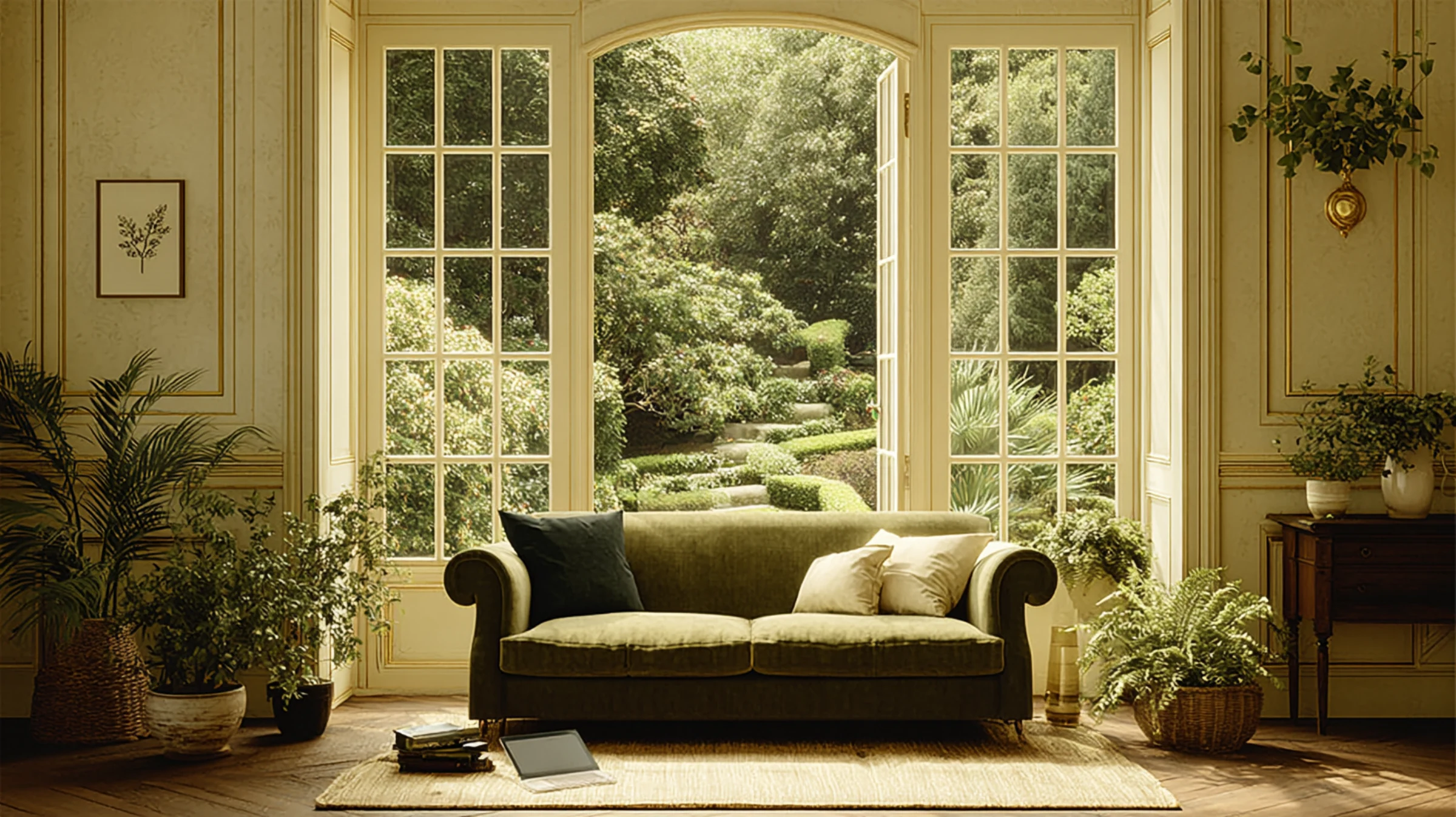
Living Room Colour Psychology: Creating Connection and Comfort
As the primary social hub of most homes, living rooms benefit from colour that foster connection, conversation, and relaxation.
Warm Neutrals for Balanced Sociability
Warm neutral tones—from soft beiges to rich taupes—create living spaces that balance sociability with relaxation.
“Warm neutrals provide an ideal foundation for social spaces,” suggests interior designer Marcus Chen. “These colour create a sense of welcome and comfort without overwhelming the senses or dominating conversation. They allow people rather than décor to become the focus of the space.”
This psychological effect explains why warm neutrals remain perennially popular in living rooms despite changing design trends—they create environments where people naturally feel at ease and engaged with one another.
Green Tones for Restoration and Balance
Various shades of green introduce a restorative quality to living spaces, creating environments that feel simultaneously refreshing and calming.
“Green occupies a unique position in Colour psychology, bridging the active and passive Colour families,” explains Colour psychologist Olivia Harrington. “This balance makes green particularly suitable for living rooms, where we want to encourage both relaxation and engagement.”
Research suggests that green environments may reduce stress hormones while enhancing creative thinking—an ideal combination for spaces where both relaxation and social interaction occur.
Blue Tones for Tranquility and Depth
Blue living rooms create atmospheres of tranquility and thoughtfulness, potentially enhancing the quality of conversations and connections.
“Blue environments have been shown to lower blood pressure and heart rate while increasing feelings of trust and security,” notes environmental psychologist Dr. Thomas Blake. “These effects can create living spaces where people feel comfortable engaging in more meaningful conversations.”
Deeper blues tend to create more formal, sophisticated atmospheres, while lighter blues establish more casual, airy environments—allowing for fine-tuning the specific social tone desired in your living space.
Application Considerations for Living Rooms
When applying Colour psychology to living rooms, consider these practical factors:
– Scale and exposure: Larger, well-lit living rooms can support deeper Colour saturation, while smaller or darker spaces may benefit from lighter tones that enhance perceived spaciousness
– Circulation patterns: Consider using Colour to define different functional zones within open-plan living areas, subtly guiding movement and activity
– Evening appearance: Since living rooms often see significant evening use, test colour under both natural and artificial lighting to ensure they create the desired atmosphere after dark
These considerations help translate Colour psychology principles into successful real-world applications that enhance how living spaces function and feel.
Bedroom Colour Psychology: Supporting Rest and Rejuvenation
As spaces dedicated to rest and intimacy, bedrooms benefit from colour that support relaxation, sleep quality, and personal expression.
Blue for Optimal Sleep Quality
Research consistently identifies blue as the most sleep-supportive Colour for bedrooms, with measurable effects on sleep duration and quality.
“Studies show that people sleeping in blue bedrooms average approximately 7.9 hours of sleep per night, compared to 6.8 hours for those in purple bedrooms,” cites sleep environment specialist Dr. Amelia Chen. “Blue environments appear to slow heart rate and reduce blood pressure, creating physiological conditions conducive to quality sleep.”
This effect is attributed to specialized receptors in the retina that detect blue light and signal the brain to produce melatonin, the hormone that regulates sleep cycles.
Green for Balance and Harmony
Green bedrooms create environments of balance and harmony that support both rest and rejuvenation.
“Green creates a perfect transitional space between the active day and restful night,” explains Colour consultant James Montgomery. “Its associations with nature evoke feelings of renewal and growth while still providing the calming qualities needed for sleep environments.”
This dual nature makes green particularly suitable for bedrooms that serve multiple functions beyond sleep, such as reading, meditation, or intimate conversation.
Soft Neutrals for Versatility and Calm
Neutral bedroom palettes create versatile backdrops that can be personalized while maintaining a sense of calm.
“Soft neutrals with warm undertones create sleep environments that feel simultaneously cocooning and expansive,” notes bedroom design specialist Sophia Williams. “These colour recede into the background, allowing the mind to quiet itself rather than processing stimulating visual information.”
This quality makes neutrals particularly effective for people who are sensitive to Colour or who prefer to change their bedroom’s character through textiles and accessories rather than wall Colour.
colour to Use Cautiously in Bedrooms
While individual preferences vary, certain colour have been shown to potentially disrupt sleep patterns when used extensively in bedrooms.
“Purple, brown, and gray bedrooms are associated with the shortest average sleep durations in research studies,” notes Dr. Chen. “Purple in particular appears to stimulate creative brain activity, potentially making it harder to quiet the mind for sleep.”
Similarly, bright reds and oranges can increase heart rate and energy levels—effects that directly counteract the physiological conditions needed for quality sleep.
Application Considerations for Bedrooms
When applying Colour psychology to bedrooms, consider these practical factors:
– Personal response: Individual associations with colour may sometimes override general principles—if a particular Colour has strong positive associations for you, these personal connections may be more relevant than general guidelines
– Lighting conditions: Consider how bedroom colour will appear under different lighting scenarios, particularly evening lighting when preparing for sleep
– Colour temperature: Warmer versions of cool colour (like warm blues with slight gray undertones) often provide the benefits of cool colour while feeling more inviting in sleep spaces
These nuanced considerations help create bedroom environments that support both quality sleep and personal expression.
Kitchen Colour Psychology: Energizing Function and Appetite
As spaces dedicated to nourishment and often serving as secondary social hubs, kitchens benefit from colour that energize, stimulate appetite, and enhance functionality.
Yellow for Energy and Optimism
Yellow kitchens create environments of energy, optimism, and mental alertness—qualities that support the functional demands of cooking and food preparation.
“Yellow stimulates the nervous system, enhancing concentration and metabolic rate,” explains nutritional psychologist Dr. Nathan Harris. “These effects can make kitchen tasks feel less like chores and more like engaging activities.”
Research suggests that yellow environments may also enhance memory and communication—beneficial effects in spaces where recipes are followed and family interactions often occur.
Red for Appetite Stimulation
Red accents in kitchens have been shown to stimulate appetite and enhance the sensory experience of food.
“Red environments increase pulse rate and stimulate the production of adrenaline, creating a state of heightened sensory awareness,” notes food psychologist Charlotte Moore. “This physiological response can make food aromas seem more intense and flavors more pronounced.”
This effect explains why red is frequently used in restaurants and food packaging—it enhances the anticipation and experience of eating.
White for Cleanliness and Efficiency
White kitchens create perceptions of cleanliness, order, and efficiency that support the functional requirements of food preparation spaces.
“White environments reflect the maximum amount of light, creating spaces where details are easily visible—an important consideration for tasks requiring precision and cleanliness,” explains kitchen designer Marcus Blackwood. “The psychological association between white and cleanliness also creates an unconscious incentive to maintain higher standards of order.”
This combination of practical and psychological benefits explains the enduring popularity of white kitchens despite changing design trends.
Blues and Greens as Appetite Suppressants
Interestingly, blue and green kitchens may actually suppress appetite—an effect that can be either beneficial or problematic depending on your goals.
“Blue is rarely found in natural foods, creating an evolutionary disconnect that may explain its appetite-suppressing effect,” suggests evolutionary psychologist Dr. Emma Blake. “Green, while common in healthy foods, signals unripeness in many fruits, potentially triggering similar appetite-reducing responses.”
This effect makes blues and greens potentially beneficial choices for those seeking to moderate food consumption, but potentially counterproductive in environments focused on food enjoyment and nourishment.
Application Considerations for Kitchens
When applying Colour psychology to kitchens, consider these practical factors:
– Natural light levels: Kitchens with limited natural light benefit from colour that maximize light reflection, while those with abundant natural light can support a wider range of Colour options
– Visual connection to adjacent spaces: In open-plan layouts, kitchen colour should create appropriate transitions to connected living and dining areas
– Cabinetry proportion: In kitchens dominated by cabinetry, the cabinet Colour becomes the primary psychological influence, often more significant than wall Colour
These considerations help translate Colour psychology principles into kitchen environments that support both functional needs and desired emotional responses.
Home Office Colour Psychology: Supporting Focus and Productivity
As work-from-home arrangements become increasingly common, understanding how Colour affects cognitive function and productivity has taken on new importance.
Blue for Focus and Efficiency
Blue environments have been shown to enhance focus, efficiency, and cognitive performance—making this Colour family particularly effective for home offices.
“Studies demonstrate that blue environments can increase productivity while reducing stress responses,” notes workplace psychologist Dr. James Harrington. “This combination creates ideal conditions for tasks requiring sustained concentration and analytical thinking.”
The calming physiological effects of blue help explain why it consistently outperforms more stimulating colour in productivity research—it allows for focus without the distraction of heightened arousal.
Green for Creativity and Balance
Green office environments support creative thinking while maintaining sufficient calm for productive work.
“Green creates a balance between stimulation and serenity that’s particularly beneficial for creative professionals,” explains design psychologist Olivia Wright. “Research suggests that green environments may enhance creative performance while reducing anxiety—an ideal combination for creative problem-solving.”
This effect makes green particularly suitable for roles requiring both analytical thinking and creative innovation.
Yellow for Optimism and Mental Energy
Yellow accents can introduce optimism and mental energy to work environments, though careful application is essential.
“Yellow stimulates the production of serotonin, potentially enhancing mood and optimism,” notes neuropsychologist Thomas Chen. “However, this stimulating effect can become overwhelming in large applications, potentially increasing anxiety and reducing focus.”
This balance explains why yellow often works best as an accent Colour in office environments rather than as the primary wall Colour.
Red for Detail-Oriented Tasks
Red environments have been shown to enhance performance on detail-oriented tasks requiring short bursts of focused attention.
“Research demonstrates that red environments can improve attention to detail and accuracy in specific tasks,” explains cognitive psychologist Dr. Charlotte Davies. “However, this effect appears to come at the cost of creative thinking and can increase stress levels during prolonged exposure.”
This trade-off makes red most effective when used selectively in areas dedicated to detailed, analytical work rather than as the primary office Colour.
Application Considerations for Home Offices
When applying Colour psychology to home offices, consider these practical factors:
– Work requirements: Different professional roles have different cognitive demands—select colour that support your specific type of work
– Natural rhythms: Consider using different colour in different areas to support various work modes—focused work, creative thinking, and collaborative discussions
– Video call backgrounds: In the era of video conferencing, consider how office colour will appear on camera and the impression they create in professional contexts
These considerations help create home office environments that actively support productivity and well-being rather than simply providing a place to work.
Bathroom Colour Psychology: Cleansing Body and Mind
Bathrooms serve both practical and restorative functions, benefiting from colour that support cleanliness, rejuvenation, and relaxation.
White for Cleanliness and Clarity
White bathrooms create powerful associations with cleanliness, purity, and order—psychological effects that align perfectly with the room’s primary function.
“The association between white and cleanliness is both cultural and biological,” explains environmental psychologist Dr. Sophia Chen. “White shows soil and impurities most clearly, creating an evolutionary advantage in identifying cleanliness that persists in our psychological responses today.”
This effect explains why white remains the most popular bathroom Colour despite constantly evolving design trends—it creates an immediate perception of hygiene and order.
Blue for Spa-Like Tranquility
Blue bathrooms evoke water associations that create feelings of tranquility and cleansing.
“Blue environments in bathrooms tap into universal associations with water as a purifying element,” notes design anthropologist Marcus Foster. “These associations create bathrooms that feel simultaneously cleansing and calming—a combination that supports both the practical and restorative functions of these spaces.”
This effect is particularly valuable in creating bathroom environments that serve as personal retreats rather than merely functional spaces.
Green for Rejuvenation and Vitality
Green bathrooms create environments of rejuvenation and natural vitality that enhance the restorative potential of bathing rituals.
“Green bathroom environments connect bathing to natural rejuvenation processes,” explains wellness designer Emma Richardson. “This connection transforms utilitarian routines into opportunities for genuine restoration and renewal.”
This effect makes green particularly appropriate for bathrooms designed as wellness spaces rather than simply cleansing areas.
Warm Neutrals for Comfort and Relaxation
Warm neutral bathrooms create environments of comfort and relaxation that counterbalance the utilitarian aspects of these spaces.
“Warm neutrals introduce a sense of comfort that can transform bathrooms from purely functional spaces into genuine retreats,” suggests interior designer Charlotte Moore. “These colour create perceptions of warmth that are both visual and psychological, making bathrooms feel more inviting and less clinical.”
This effect is particularly valuable in creating bathroom environments that encourage lingering and relaxation rather than simply efficient use.
Application Considerations for Bathrooms
When applying Colour psychology to bathrooms, consider these practical factors:
– Natural light availability: Bathrooms with limited natural light benefit from colour that maximize light reflection, while those with abundant natural light can support a wider range of Colour options
– Perceived temperature: Colour significantly impacts perceived temperature—cooler colour can make bathrooms feel less cozy, requiring balance through lighting, textiles, and materials
– Water reflections: Consider how colour will interact with water reflections, potentially intensifying Colour effects in unexpected ways
These considerations help create bathroom environments that support both practical functionality and emotional well-being.
Dining Room Colour Psychology: Enhancing Social Connection and Appetite
As spaces dedicated to nourishment and connection, dining rooms benefit from colour that stimulate both appetite and conversation.
Red for Appetite and Energy
Red dining rooms create environments of energy and stimulation that enhance both appetite and social engagement.
“Red environments increase heart rate and stimulate adrenaline production, creating states of heightened awareness and engagement,” explains social psychologist Dr. James Montgomery. “These physiological responses can make both food and conversation seem more stimulating and engaging.”
This effect explains why red is frequently used in restaurants seeking to create lively, energetic dining experiences with higher table turnover rates.
Orange for Comfort and Conversation
Orange dining environments balance stimulation with comfort, creating spaces that encourage both appetite and relaxed conversation.
“Orange combines the appetite-stimulating effects of red with the comfort associations of yellow,” notes Colour psychologist Olivia Harrington. “This combination creates dining environments where people tend to eat with enjoyment while also lingering for conversation.”
This balanced effect makes orange particularly suitable for family dining spaces where both nourishment and connection are primary goals.
Green for Balance and Lingering
Green dining rooms create environments of balance that encourage lingering and thoughtful connection.
“Green dining environments tend to slow eating pace while enhancing comfort,” explains dining behavior researcher Dr. Nathan Harris. “This combination creates spaces where meals naturally extend into meaningful conversation rather than concluding quickly.”
This effect makes green particularly appropriate for dining rooms intended for extended family meals, dinner parties, or other occasions where the social aspect of dining takes precedence over mere nourishment.
Neutral Foundations with Colourful Accents
Neutral dining rooms with strategic Colour accents create versatile environments that can be adjusted for different dining occasions.
“Neutral foundations allow for Colour to be introduced through elements that can be easily changed—table linens, serving ware, flowers, artwork,” suggests entertaining specialist Emma Blake. “This flexibility allows the dining environment to be customized for different occasions and seasons.”
This approach is particularly valuable for dining spaces that serve multiple functions or host various types of gatherings with different atmospheric requirements.
Application Considerations for Dining Rooms
When applying Colour psychology to dining rooms, consider these practical factors:
– Lighting scenarios: Dining rooms often transition from daylight to evening use—test colour under both conditions, paying particular attention to how they appear under the warm lighting typically used during evening meals
– Food presentation: Consider how different foods will appear against your Colour scheme—neutral backgrounds often allow food to become the visual focus
– Connection to kitchen: In open-plan layouts, create thoughtful Colour transitions between cooking and dining areas that acknowledge their connected functions while establishing distinct zones
These considerations help create dining environments that enhance both the sensory experience of food and the quality of social connection.
Children’s Room Colour Psychology: Supporting Development and Rest
Children’s rooms serve multiple functions—from sleep and play to study and social interaction—requiring thoughtful Colour approaches that support various developmental needs.
Blue for Calm and Focus
Blue children’s rooms create environments that support both restful sleep and focused activity.
“Research indicates that blue environments can reduce aggressive behavior and hyperactivity while supporting concentration,” notes child development specialist Dr. Charlotte Davies. “These effects make blue particularly suitable for children who are easily overstimulated or have difficulty transitioning to sleep.”
The versatility of blue explains its enduring popularity in children’s spaces across different age groups and genders.
Green for Balance and Growth
Green children’s rooms create balanced environments that support both active play and restful recovery.
“Green environments appear to support balanced development, encouraging both physical activity and quiet focus,” explains educational psychologist Marcus Chen. “This versatility makes green particularly suitable for rooms that must support multiple functions throughout the day.”
The natural associations of green also introduce subtle connections to growth and development that align with childhood’s primary purpose.
Yellow for Optimism and Energy
Yellow accents (rather than full rooms) can introduce positive energy to children’s spaces when used judiciously.
“Yellow environments stimulate optimism and mental activity, potentially enhancing learning and creative play,” notes child psychologist Dr. Sophia Williams. “However, this stimulating effect can interfere with sleep and relaxation when used too extensively.”
This balance explains why yellow often works best as an accent Colour in children’s rooms rather than as the primary wall Colour, particularly in sleep areas.
Colour Zoning for Multifunctional Spaces
Using different colour to define various functional zones can help children understand and navigate their environments.
“Colour zoning creates visual cues that help children understand appropriate activities for different areas,” explains early childhood environment designer James Harrington. “This approach supports developing executive function by providing environmental cues for behavior regulation.”
This strategy might involve calmer colour in sleep and study areas with more energetic hues in play zones, creating intuitive environmental guidance for appropriate activities.
Age-Appropriate Colour Considerations
Children’s Colour preferences and responses evolve with age, requiring different approaches for different developmental stages.
“Infants and toddlers respond primarily to Colour contrast rather than specific hues,” explains developmental researcher Dr. Emma Richardson. “As children develop, their Colour preferences become more defined, with younger children typically preferring bright, saturated colour while adolescents often gravitate toward more complex, sophisticated palettes.”
This evolution suggests that children’s room colour should ideally evolve with their developmental stage rather than remaining static throughout childhood.
Application Considerations for Children’s Rooms
When applying Colour psychology to children’s rooms, consider these practical factors:
– Adaptability: Choose approaches that can evolve as children grow, perhaps using more permanent neutral foundations with Colour introduced through elements that can be easily changed
– Individual temperament: Consider the specific child’s temperament and sensitivities—children who are naturally high-energy may benefit from calmer environments, while quieter children might benefit from more stimulating surroundings
– Circadian considerations: Ensure that sleep areas support healthy circadian rhythms through colour that signal rest and relaxation
These considerations help create children’s environments that actively support development rather than simply decorating based on current preferences or trends.
Hallway and Transition Space Colour Psychology
Often overlooked in Colour planning, hallways and transition spaces significantly impact how we experience our homes as cohesive environments.
Creating Flow and Continuity
Hallway colour can create either continuity or deliberate transitions between different rooms, significantly affecting how the home feels as a complete environment.
“Transition spaces offer an opportunity to either unify disparate rooms or create intentional thresholds between different functional zones,” explains architectural psychologist Dr. Thomas Blake. “This choice dramatically impacts how we experience the home’s overall narrative.”
For homes seeking cohesion, hallways in neutral tones that complement adjacent rooms create visual flow. For homes embracing distinct room personalities, hallways can serve as palate cleansers between more distinctive spaces.
Expanding Perceived Space
Colour can dramatically affect how spacious narrow hallways and transition areas feel.
“Hallways benefit from colour that visually recede rather than advance,” notes spatial perception specialist Charlotte Moore. “Lighter tones with cool undertones typically create the greatest sense of spaciousness in these often-confined areas.”
This effect is particularly valuable in older homes with narrower corridors or limited natural light in circulation spaces.
Creating Psychological Transitions
Thoughtfully selected hallway colour can create psychological preparation for the rooms they connect.
“Transition spaces can serve as decompression zones between areas with different functions and energy levels,” suggests environmental psychologist Marcus Blackwood. “colour in these spaces can help us mentally shift from work to relaxation, or from public to private domains.”
This transitional function makes hallways particularly important in homes where work and living spaces coexist, creating psychological boundaries where physical ones may be limited.
Application Considerations for Transition Spaces
When applying Colour psychology to hallways and transition spaces, consider these practical factors:
– Light conditions: Hallways often have limited natural light—test colour under the specific lighting conditions that will typically illuminate these spaces
– Directional guidance: Consider using Colour to subtly guide movement through the home, perhaps using slightly deeper tones to draw the eye toward destination spaces
– Artwork display: Many hallways serve as gallery spaces—select background colour that complement the artwork you intend to display
These considerations transform often-overlooked transition spaces into valuable contributors to the home’s overall psychological experience.
Practical Application: Creating Your Home’s Colour Psychology Strategy
Moving from theoretical understanding to practical application requires a systematic approach to Colour selection that considers both psychological principles and practical realities.
Assessing Your Colour Personality
Before selecting specific room colour, consider your personal and family responses to different Colour families.
“Individual Colour responses show some variation based on personal experience, cultural background, and even neurological differences,” explains Colour response researcher Dr. Amelia Chen. “Understanding your specific responses provides an essential foundation for effective Colour selection.”
This assessment might involve reflecting on environments where you’ve felt particularly comfortable or energized, colour that consistently attract or repel you, and spaces where you’ve experienced either positive or negative emotional responses.
Analyzing Room Functions and Goals
Each room’s specific functions and emotional goals should guide Colour selection beyond general principles.
“The most successful Colour strategies align with how you actually use spaces rather than how they’re conventionally defined,” suggests lifestyle designer Emma Blake. “A dining room primarily used for work requires different Colour considerations than one exclusively used for entertaining.”
This functional analysis ensures that Colour choices actively support your specific lifestyle rather than generic room designations.
Creating Whole-Home Colour Flow
While each room may have distinct Colour needs, creating thoughtful transitions between spaces ensures the home feels cohesive rather than fragmented.
“Whole-home Colour strategies create visual conversations between spaces rather than isolated Colour statements,” explains interior designer James Foster. “These connections might involve shared undertones, related Colour families, or deliberate contrast relationships that create meaningful dialogue between adjacent areas.”
This holistic approach transforms individual room colour from isolated decisions into a comprehensive environmental strategy that shapes how you experience your entire home.
Testing Before Committing
Perhaps the most crucial practical step involves thorough testing before implementing Colour decisions.
“Never select colour based solely on small paint chips, digital representations, or how they appear in showrooms or other homes,” cautions paint specialist Olivia Wright. “colour transform dramatically based on specific light conditions, room dimensions, and surrounding elements.”
Effective testing involves:
– Painting large sample boards (at least 2′ square) rather than small swatches
– Viewing samples at different times of day to assess how changing light affects the Colour
– Placing samples against existing elements like flooring, cabinetry, and furniture
– Living with samples for several days to observe how your response evolves with familiarity
This thorough testing process prevents costly mistakes while ensuring your selected colour will create the psychological effects you desire.
Conclusion: The Transformative Power of Intentional Colour
Understanding room-by-room Colour psychology transforms paint selection from a purely aesthetic decision into a powerful tool for shaping how we experience our homes. By aligning Colour choices with both the functional requirements of each space and the psychological responses they evoke, we create environments that actively support rather than merely contain our daily activities and emotional needs.
The most successful home Colour strategies balance universal psychological principles with personal preferences and specific contextual factors. They acknowledge that while certain Colour responses show remarkable consistency across populations, individual variations and specific environmental conditions add important nuance to Colour selection decisions.
As you develop your home’s Colour strategy, remember that the goal isn’t to rigidly apply universal rules but rather to make informed choices that align with your specific needs and preferences. The power of Colour psychology lies not in prescriptive formulas but in the thoughtful consideration of how different hues might shape your daily experience—creating a home that feels not simply decorated, but psychologically attuned to how you live, work, and connect with others.
In a world where our homes increasingly serve multiple functions—from workplaces to wellness retreats—this intentional approach to Colour selection becomes increasingly valuable. By harnessing the psychological power of Colour, we create environments that don’t merely reflect our personalities but actively support our well-being, productivity, and connections with others—transforming houses into homes that nurture both body and mind.