Cottage Chic: The Timeless Neutral Palette
In the ever-evolving world of interior design, few aesthetics have demonstrated the enduring appeal of cottage chic style. This quintessentially British approach to home decoration balances rustic charm with refined…
House of Willow Alexander·
In the ever-evolving world of interior design, few aesthetics have demonstrated the enduring appeal of cottage chic style. This quintessentially British approach to home decoration balances rustic charm with refined elegance, creating spaces that feel simultaneously sophisticated and welcoming. At the heart of this enduring style lies a thoughtfully curated neutral color palette—one that creates the perfect backdrop for both traditional and contemporary elements while establishing the warm, inviting atmosphere that defines cottage interiors.
The Essence of Cottage Chic Style
Before exploring the specific color palettes that define cottage chic interiors, it’s worth understanding the fundamental elements that characterize this beloved design approach.
“Cottage chic isn’t simply about recreating a rural aesthetic,” explains interior designer Charlotte Davies. “It’s about capturing a feeling—that sense of comfort, history, and unpretentious elegance that makes British cottages so appealing. The color palette is perhaps the most crucial element in establishing this atmosphere.”
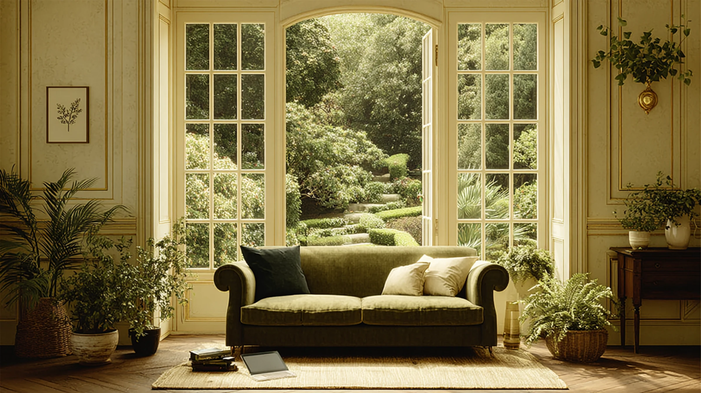
This distinctive style balances several seemingly contradictory elements: it’s relaxed yet refined, traditional yet fresh, and simple yet sophisticated. The neutral color palette serves as the foundation that allows these contrasting elements to harmonize beautifully.
The Evolution of Cottage Neutrals
The neutral palette associated with cottage style has evolved significantly over the decades, moving from the cream-heavy schemes of the 1980s and 90s to today’s more nuanced approach.
“Contemporary cottage chic embraces a much more sophisticated understanding of neutrals,” notes color historian Dr. Emma Richardson. “Where earlier interpretations relied heavily on simple creams and beiges, today’s cottage interiors feature complex neutrals with subtle undertones that create much richer, more layered environments.”
This evolution reflects broader changes in color technology and design sensibility, with modern paint formulations offering unprecedented subtlety and depth in neutral tones.
Benjamin Moore’s Cottage Chic Palette: A Case Study in Neutral Sophistication
Paint manufacturer Benjamin Moore has been at the forefront of developing sophisticated neutral palettes that perfectly capture contemporary cottage chic aesthetics. Their dedicated cottage palette offers valuable insights into the specific tones that define this style.
The Foundation: Warm White Bases
At the foundation of cottage chic color schemes lie warm whites that provide luminosity without the starkness of pure white.
“The ideal cottage whites have a softness that pure whites lack,” explains color consultant Marcus Chen. “They contain subtle yellow or pink undertones that create a gentle glow rather than a harsh brightness, particularly important in British homes where natural light is often softer and more diffused.”
Notable examples from Benjamin Moore’s collection include:
– White Dove (OC-17): With its balance of warmth and crispness, this versatile white creates an inviting base that works beautifully across various lighting conditions.
– Swiss Coffee (OC-45): Slightly warmer than White Dove, this soft white contains subtle yellow undertones that create a cozy, enveloping quality perfect for cottage interiors.
– Seapearl (OC-19): With its hint of gray undertone, this sophisticated white adds a contemporary edge to cottage interiors while maintaining essential warmth.
These warm whites typically serve as ceiling and trim colors in cottage schemes, while also appearing on cabinetry and built-ins to create a sense of airiness and cohesion.
Soft Neutral Paint Colors: The Heart of Cottage Chic
Beyond whites, the cottage chic palette embraces a range of soft neutrals that add depth and character while maintaining the style’s signature restraint.
“The most successful cottage neutrals have a certain ambiguity,” notes paint specialist Thomas Wright. “They might read as pale gray in some lights, soft beige in others, with subtle undertones that respond to changing daylight. This complexity creates interiors that feel alive and responsive rather than flat or static.”
Key examples include:
– Edgecomb Gray (HC-173): This chameleon-like neutral shifts between warm gray and soft beige depending on the light, creating walls that feel sophisticated yet welcoming.
– Pale Oak (OC-20): With its subtle pink undertone, this warm neutral creates a flattering, gentle atmosphere that complements both traditional cottage elements and contemporary additions.
– Revere Pewter (HC-172): Slightly deeper than other cottage neutrals, this greige (gray-beige hybrid) adds architectural definition while maintaining the soft, approachable quality essential to cottage style.
These neutrals typically appear on walls, creating a sophisticated backdrop that allows architectural details and furnishings to shine.
Accent Neutrals: Adding Depth Without Color
Where many design styles rely on distinct accent colors, cottage chic often maintains its neutral integrity by incorporating deeper neutrals as accents instead.
“Rather than introducing obviously contrasting colors, sophisticated cottage schemes often layer deeper neutrals to create visual interest,” explains interior designer Olivia Harrington. “This approach maintains the serene, cohesive quality that makes cottage interiors so appealing while preventing them from feeling flat or monotonous.”
Effective accent neutrals include:
– Kingsport Gray (HC-86): This mid-tone neutral with subtle green undertones adds architectural definition when used on woodwork, kitchen islands, or as an accent wall.
– Chelsea Gray (HC-168): With its perfect balance between warm and cool undertones, this sophisticated deeper neutral adds drama without heaviness when used selectively.
– Kendall Charcoal (HC-166): For more contemporary cottage interpretations, this deep, complex neutral creates striking contrast while maintaining the palette’s sophisticated restraint.
These deeper neutrals typically appear on furniture pieces, interior doors, window frames, or as occasional accent walls to create depth and definition.
Understanding Neutral Color Undertones
The success of a cottage chic neutral palette depends largely on understanding and harmonizing color undertones—the subtle hues that influence how a neutral reads in different lighting conditions.
Identifying Undertones in Neutral Colors
“Every neutral color has undertones—subtle hints of color that might not be immediately obvious but significantly impact how the color behaves in a space,” explains color psychologist Dr. James Foster. “The most common undertones in neutrals are yellow, pink, green, and blue.”
To identify undertones:
1. Compare the neutral against a sheet of pure white paper to make the undertone more visible
2. Observe the color in different lighting conditions throughout the day
3. Place samples of different neutrals side by side to make their undertones more apparent through comparison
4. Consider how the color makes you feel—warm undertones (yellow, pink) create coziness, while cool undertones (blue, green) create a fresher atmosphere
This understanding allows for more intentional color selection that creates harmonious, sophisticated schemes.
Creating Cohesion Through Undertone Consistency
The most successful cottage neutral palettes maintain consistency in undertones across different colors, creating schemes that feel intentional and harmonious.
“When undertones clash—for instance, pairing a yellow-based beige with a pink-based white—spaces can feel uncomfortable without the viewer necessarily understanding why,” notes color consultant Charlotte Moore. “Maintaining undertone consistency creates interiors that feel ‘right’ even if the viewer can’t articulate exactly why.”
This doesn’t mean all neutrals must have identical undertones, but rather that they should be compatible—warm undertones with warm, cool with cool, or deliberately contrasted for specific effect.
Lighting Considerations for Neutral Interiors
The interaction between neutrals and light is particularly crucial in cottage interiors, where the quality of light significantly impacts how colors are perceived.
“British light tends to be softer and more diffused than in sunnier climates, with a slightly blue quality, particularly in northern exposures,” explains lighting designer Marcus Blackwood. “This means neutrals often read cooler than they might elsewhere, making undertone selection particularly important.”
Consider these lighting factors when selecting cottage neutrals:
– North-facing rooms: These receive cooler, bluish light that can make neutrals appear more gray or blue. Compensate with slightly warmer neutrals that have yellow or pink undertones.
– South-facing rooms: These enjoy warmer, more direct light that enhances the warmth in neutrals. Even cooler neutrals will read warmer in these spaces.
– East/West-facing rooms: These experience dramatic light changes throughout the day. Test colors during different times to ensure they work throughout the day’s lighting cycle.
– Artificial lighting: The color temperature of bulbs significantly impacts neutrals. Warm white bulbs (2700-3000K) enhance the cozy quality of cottage neutrals, while cooler bulbs can make warm neutrals appear dull or muddy.
Testing paint samples under different lighting conditions is essential for successful neutral color selection in cottage interiors.
Neutral Color Combinations: Creating Depth and Interest
While individual neutrals create the foundation of cottage chic interiors, the artful combination of multiple neutrals creates the depth and interest that distinguishes sophisticated schemes.
The Rule of Three: A Framework for Neutral Palettes
“A good starting point for cottage neutral schemes is the rule of three,” suggests interior designer Emma Blake. “Select three neutrals within the same family but at different depths—light, medium, and dark—to create a scheme with built-in harmony and contrast.”
This approach might include:
– A warm white for ceilings, trim, and some cabinetry (light)
– A mid-tone neutral for walls (medium)
– A deeper neutral for accents, furniture pieces, or architectural features (dark)
This simple framework creates schemes with inherent balance while maintaining the restrained palette essential to cottage style.
60-30-10 Distribution for Visual Balance
Once you’ve selected your three core neutrals, the 60-30-10 rule provides guidance for their distribution throughout the space.
“This classic interior design principle suggests using your primary neutral for approximately 60% of the space (typically walls), your secondary neutral for about 30% (often larger furniture pieces, cabinetry, or significant architectural elements), and your accent neutral for the remaining 10% (accessories, smaller furniture, or architectural details),” explains design educator Dr. Sophia Williams.
This distribution creates visual hierarchy and interest while maintaining overall harmony—essential qualities in cottage chic interiors.
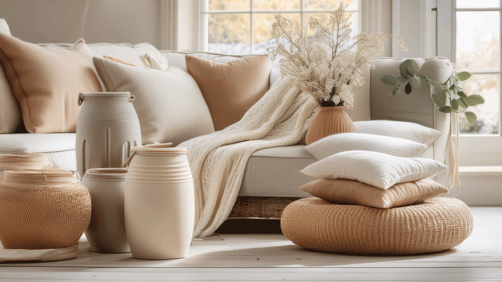
Textural Variation Within a Limited Palette
Perhaps the most distinctive characteristic of sophisticated cottage neutral schemes is their emphasis on textural variation rather than color contrast to create visual interest.
“When working with a limited neutral palette, texture becomes the primary tool for creating depth and preventing monotony,” notes textile specialist Thomas Blake. “Incorporating multiple textures—rough linens, smooth cottons, nubby wools, glossy ceramics, matte woods—creates visual complexity and tactile richness without introducing additional colors.”
This textural approach is particularly effective in cottage interiors, where the interplay of historic and contemporary elements naturally introduces textural variety.
Room-by-Room Application of Cottage Neutral Palettes
While the principles of cottage neutral palettes apply throughout the home, their specific application varies by room according to function and desired atmosphere.
Living Rooms: Comfort and Sophistication
In cottage living rooms, neutral palettes create backdrops that highlight architectural features while establishing a comfortable, inviting atmosphere.
“Living room neutrals should create a sense of timeless comfort,” suggests interior designer Charlotte Davies. “Slightly warmer neutrals on walls create an enveloping quality, while deeper neutrals on architectural features like fireplaces or built-in bookcases add definition and character.”
Effective living room neutral combinations include:
– Warm white (Benjamin Moore White Dove) on ceilings and trim
– Soft warm neutral (Benjamin Moore Manchester Tan) on walls
– Deeper neutral (Benjamin Moore Chelsea Gray) on fireplace surround or built-ins
– Textural variation through natural fiber rugs, linen upholstery, and wooden furniture
This approach creates living rooms that feel simultaneously sophisticated and welcoming—the essence of cottage chic style.
Kitchens: Timeless Functionality
Cottage kitchens benefit from neutral palettes that create timeless backdrops for both culinary activity and social gathering.
“Kitchen neutrals should prioritize light reflection and timelessness,” notes kitchen designer Marcus Chen. “Slightly crisper neutrals create a sense of cleanliness and light, while deeper neutrals on islands or lower cabinetry add grounding weight and visual interest.”
Successful cottage kitchen neutral schemes include:
– Warm white (Benjamin Moore Swiss Coffee) on upper cabinetry and ceilings
– Soft greige (Benjamin Moore Edgecomb Gray) on walls
– Deeper neutral (Benjamin Moore Kingsport Gray) on islands or lower cabinetry
– Natural materials like wood countertops, stone surfaces, and ceramic tiles adding textural complexity
This layered neutral approach creates kitchens that feel both practical and beautiful—spaces that will remain relevant and appealing for years to come.
Bedrooms: Serene Retreats
In cottage bedrooms, neutral palettes create serene environments conducive to rest and relaxation.
“Bedroom neutrals should promote tranquility and comfort,” explains sleep environment specialist Dr. Amelia Chen. “Slightly softer, more muted neutrals create a gentle, cocooning atmosphere that supports restful sleep while maintaining the cottage aesthetic.”
Effective bedroom neutral palettes include:
– Soft warm white (Benjamin Moore Seapearl) on ceilings and trim
– Gentle neutral with subtle pink undertones (Benjamin Moore Pale Oak) on walls
– Slightly deeper neutral (Benjamin Moore Revere Pewter) on furniture or architectural features
– Layered bedding in varied neutral tones and textures creating inviting, comfortable sleeping environments
This approach creates bedrooms that feel like genuine retreats—spaces that promote both physical rest and emotional well-being.
Bathrooms: Light-Enhancing Neutrals
Cottage bathrooms benefit from neutrals that maximize light while creating warm, inviting atmospheres.
“Bathroom neutrals should prioritize light reflection while maintaining warmth,” suggests bathroom designer James Harrington. “Slightly crisper neutrals with subtle warm undertones create spaces that feel clean and bright without the clinical quality that pure whites can introduce.”
Successful bathroom neutral combinations include:
– Warm white (Benjamin Moore White Dove) on ceilings and trim
– Light neutral with subtle warmth (Benjamin Moore Classic Gray) on walls
– Natural materials like limestone, marble, or wood adding textural interest and warmth
– Deeper neutral accents through cabinetry, mirror frames, or accessories
This approach creates bathrooms that balance practical considerations with the warm, welcoming quality essential to cottage style.
Pairing Neutrals with Other Elements
While neutrals form the foundation of cottage chic interiors, their interaction with other elements—from architectural features to textiles and accessories—determines the overall success of the design.
Neutrals and Natural Materials
Perhaps the most important relationship in cottage interiors is between neutral paint colors and the natural materials that add warmth and character.
“The beauty of sophisticated neutral palettes is their ability to showcase natural materials rather than competing with them,” notes materials specialist Olivia Wright. “The subtle undertones in well-chosen neutrals can enhance the natural beauty of wood, stone, and other organic elements.”
Successful pairings include:
– Warm neutrals with honey-toned woods, enhancing their natural warmth
– Greige tones with limestone or marble, complementing their natural variations
– Deeper neutrals with darker woods, creating sophisticated contrast
– Soft whites with natural linens and cottons, creating serene, cohesive environments
This harmonious relationship between neutrals and natural materials creates the authentic, grounded quality that distinguishes genuine cottage style from more superficial interpretations.
Neutrals as Backdrops for Textiles
In cottage interiors, neutrals often serve as sophisticated backdrops for textiles that introduce pattern, texture, and occasional color.
“A well-executed neutral scheme creates the perfect canvas for textiles to shine,” explains textile designer Emma Richardson. “Whether featuring traditional patterns like toile and ticking stripes or more contemporary designs, textiles add personality and depth to neutral foundations.”
Effective approaches include:
– Warm neutral walls showcasing vintage quilts or tapestries
– Crisp white bedding providing contrast for patterned cushions and throws
– Neutral upholstery allowing decorative pillows to create seasonal color changes
– Neutral curtain foundations layered with patterned valances or trims
This layered approach allows for periodic refreshment through textile changes while maintaining the timeless quality of the neutral foundation.
Neutrals and Architectural Features
In cottages with distinctive architectural elements, neutrals can either highlight or downplay these features depending on the desired effect.
“Neutral color strategies can transform how architectural elements are perceived,” notes architectural color specialist Dr. James Montgomery. “The same feature can be emphasized through contrast or integrated through color matching, dramatically changing how the space reads.”
Strategic approaches include:
– Painting trim and walls in the same neutral to create a more contemporary, seamless look
– Using contrasting neutrals to highlight distinctive moldings or architectural details
– Applying deeper neutrals to built-in elements to create the appearance of furniture
– Using consistent neutrals across architectural transitions to visually expand smaller spaces
These thoughtful applications transform neutrals from simple background colors to active design elements that shape how spaces are perceived and experienced.
Creating Your Own Cottage Chic Neutral Palette
Developing a personalized cottage neutral palette requires thoughtful consideration of your specific space, preferences, and existing elements.
Assessing Your Starting Point
Before selecting specific neutrals, evaluate the fixed elements and natural conditions that will influence your color scheme.
“Begin by analyzing the unchangeable aspects of your space,” advises color consultant Charlotte Moore. “Consider the quality and direction of natural light, the undertones in existing flooring or stone, and any architectural features you’ll be working with rather than changing.”
This assessment provides crucial context for selecting neutrals that will harmonize with your specific conditions rather than fighting against them.
Testing Colors in Context
Perhaps the most crucial step in creating successful neutral schemes is thorough testing within your actual space.
“Never select neutrals based solely on how they appear in showrooms, on screens, or even in other homes,” cautions paint specialist Thomas Wright. “The specific light conditions, architectural features, and surrounding elements in your space will dramatically impact how neutrals read.”
Effective testing includes:
– Painting large sample boards (at least 2′ square) rather than small swatches
– Viewing samples at different times of day to assess how light changes affect the color
– Placing samples against existing elements like flooring, stone, and wood to check for harmony
– Living with samples for several days before making final decisions
This thorough testing process prevents costly mistakes and ensures your selected neutrals will create the atmosphere you desire.
Building a Cohesive Scheme
Once you’ve identified neutrals that work in your space, create a comprehensive scheme that addresses all elements.
“A truly successful neutral palette addresses every surface and element in a space,” explains interior designer Marcus Blackwood. “Document specific colors for walls, trim, ceilings, cabinetry, and other painted elements to ensure cohesion during implementation.”
This documentation might take the form of a simple color schedule that lists:
– Each surface or element
– The specific neutral assigned to it
– The paint finish (matte, eggshell, satin, etc.)
– Any special application notes
This systematic approach ensures your vision translates accurately during the painting process.
Conclusion: The Timeless Appeal of Cottage Neutrals
The enduring popularity of cottage chic style speaks to its unique ability to create spaces that feel simultaneously fresh and timeless, sophisticated and welcoming. At the heart of this beloved aesthetic lies the thoughtful application of neutral color palettes—not as default choices lacking imagination, but as deliberately curated foundations that establish atmosphere, showcase natural materials, and create backdrops for personal expression.
The most successful cottage neutral schemes transcend trends, creating environments that remain relevant and appealing for years rather than seasons. They balance warmth with sophistication, simplicity with depth, and tradition with freshness—the very qualities that define cottage chic style itself.
As you develop your own interpretation of this enduring aesthetic, remember that the power of neutrals lies not in their simplicity but in their subtlety. The most sophisticated cottage interiors feature neutrals selected with careful attention to undertones, lighting conditions, and material interactions—creating spaces that feel effortlessly harmonious rather than arbitrarily assembled.
In a world of rapidly changing design trends, the timeless neutral palette of cottage chic style offers something increasingly precious: interiors that feel both current and enduring, fashionable and timeless, designed and authentic. Perhaps this explains why, decade after decade, we continue to be drawn to these serene, sophisticated spaces that feel less like showcases and more like homes.